Icon design
I designed more than 400 icons while in charge of UI design for the application suite. Designing them myself allowed me to guarantee consistency across all products and to address specific needs.
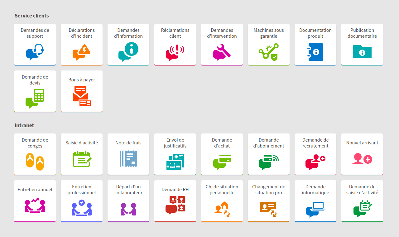
A selection of tiles providing access to services within web applications.
The use of icon libraries, which seems rather common place, can hardly cover the very specific needs implied with professional, specialized topics. While libraries seem to promise gains in time and efficiency, benefits are not so obvious. That would mean searching, selecting, and most certainly alter or combine icons to cover every need and guarantee consistency.

A few icons from the EDM software.
That’s why designing them myself from scratch appeared as an obvious choice. Icon needs actually proved to be more and more specific, and I also had to make sure they looked good in any size we wanted.
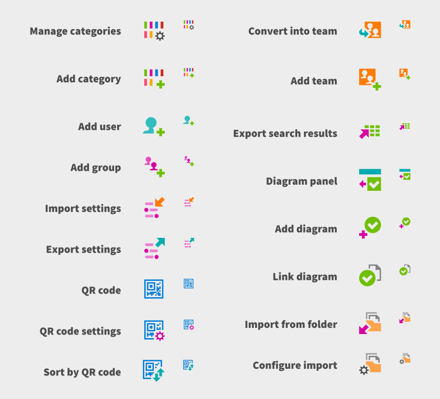
A piece of artboard containing more EDM icons.
To make sure icons look crisp, outlines are carefully aligned to a pixel grid. I also adapted their level of details depending on intended display size. For instance, a calendar looks different wether it is used as a 24 x 24 dip (device independant pixel) icon, as the main element of a 64 x 64 dip icon or as a smaller part of an icon of the same size.
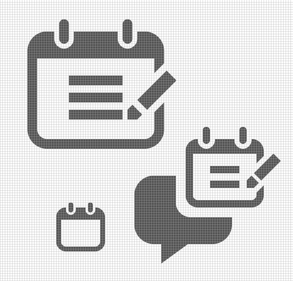
A calendar drawing varies depending on intended display size - it is more than merely resizing a single, all-purpose design.
