Rich Interface Design
As a UI art director for a digital transformation software editor, I was in charge of interface design for a range of products with different background stories - which meant disparate and often dated designs. My mission was to carry out a full redesign, ensuring satisfying user experience and consistent brand identity across products.
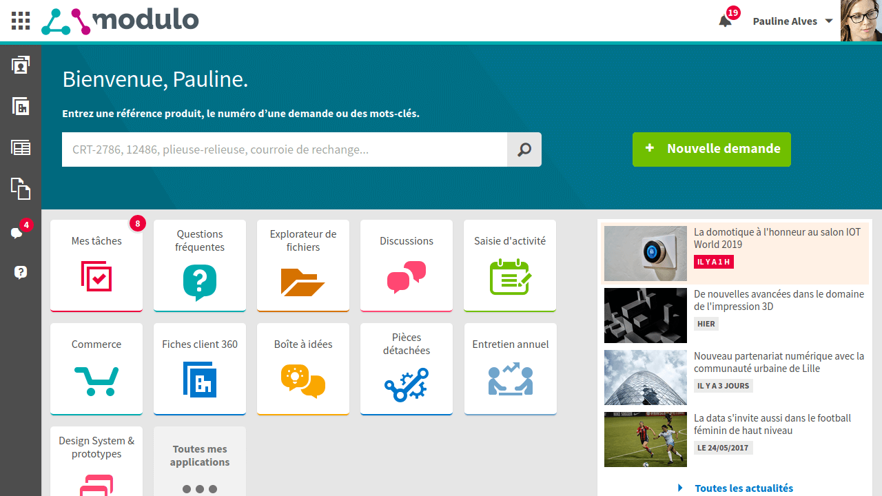
The ERP home page can be configured for various needs, such as customer service or intranet portals.
In collaboration with two UX designers, my part of the job covered every aspect of UI design : hi-fi prototyping including micro-interactions and animations, icon design, and in the long term building a design system.
The job often consisted in handling screens that are often viewed as necessarily dull and ugly. Users have to cope with them every day or week, though, so why not give them our best effort in terms of design?
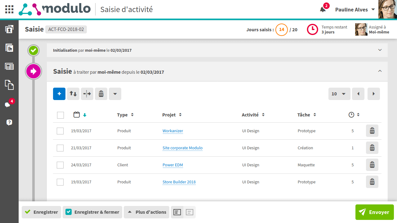
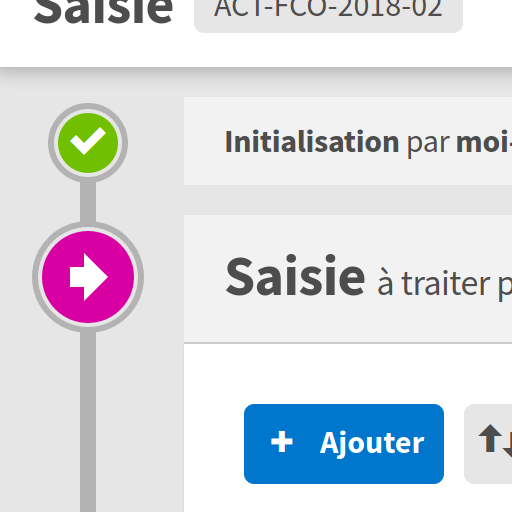
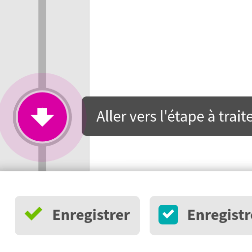
As boring as they may be perceived, intranet tables and forms deserve craftwork. It’s all about white space, typography and contrast.
I also had to defend choices that differed from those observed among famous competitors and often left unchallenged - for instance, in our messaging app, I made a point of constraining paragraphs to a maximum width, or allowing multiline in the discussions list to avoid truncated titles.
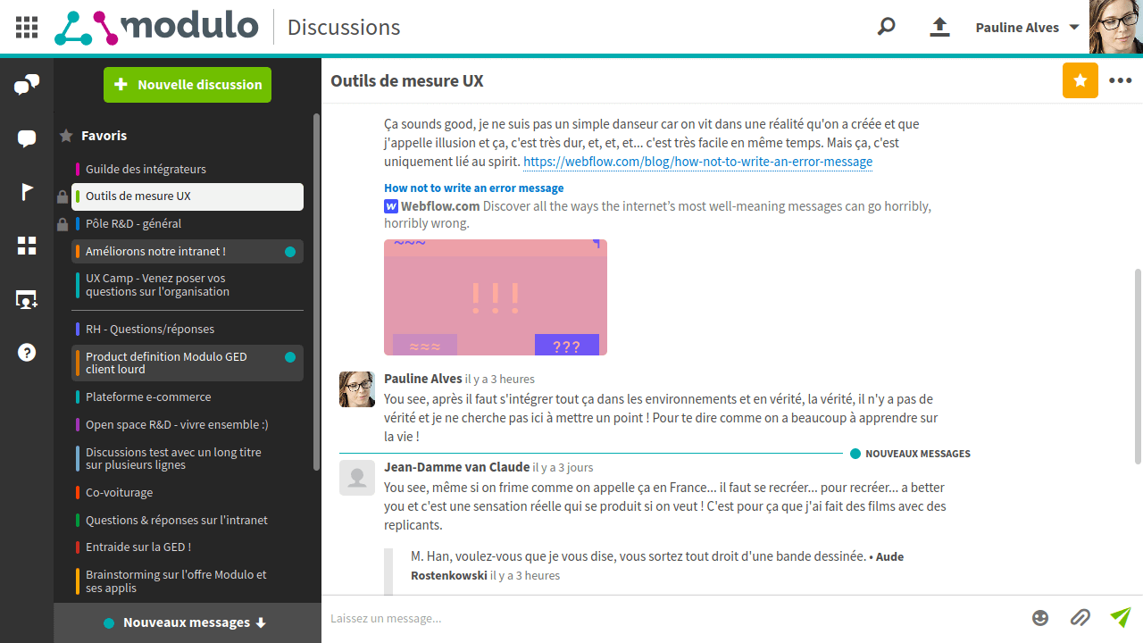
The messaging app.
One of our products was a desktop client dedicated to electronic document management (EDM). Our UX designers decided to make it reminiscent, ergonomics-wise, of the Microsoft Office suite that our target users were familiar with. With those characteristics in mind - which set the product apart from our web-based apps - I ensured visual consistency through icon design, colors and typography.
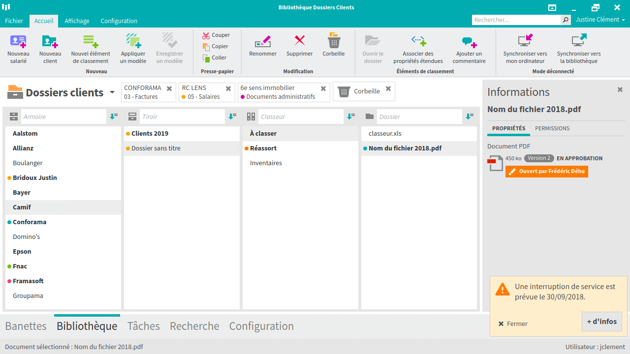
The EDM rich client interface.
I designed numerous screens, providing HTML/CSS/JS protoptypes - which appeared to me as the best way to ensure developement teams get an accurate view of the expected final design, including animations, interactions and responsiveness.
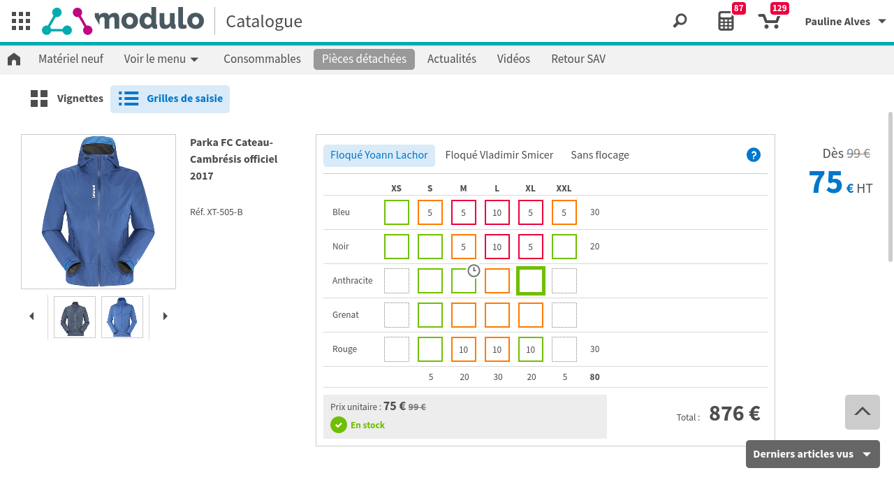
B-to-B e-commerce platform. Above, stock order of items in various colors and sizes using grid inputs.
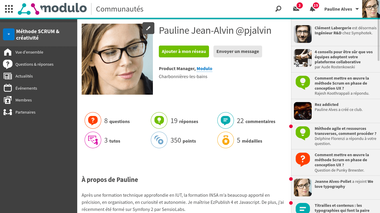
Profile screen of a community platform dedicated to knowledge sharing and professional networking.
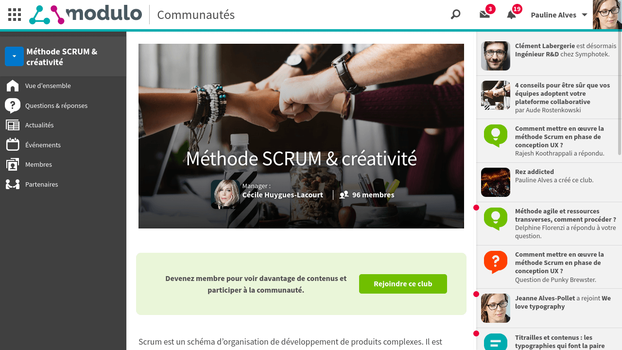
Users can join thematic clubs which grant access to Q&A sections, tutorials…
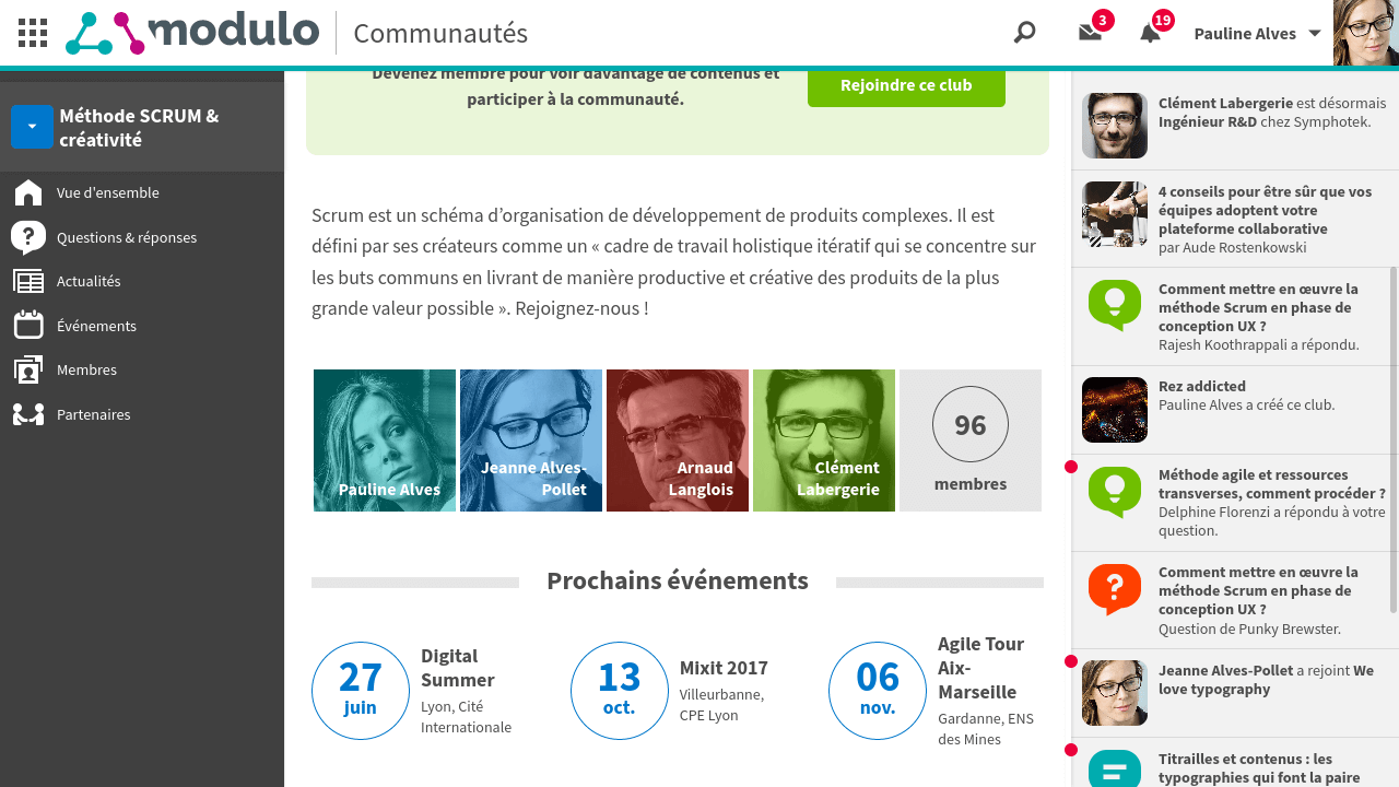
… they can also grow their professional network and apply for events.
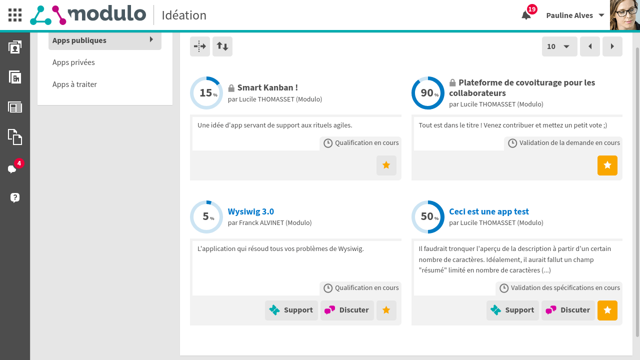
Innovation platform. Users can submit new app ideas then discuss them with the community and the production team.
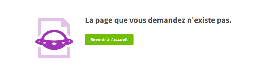
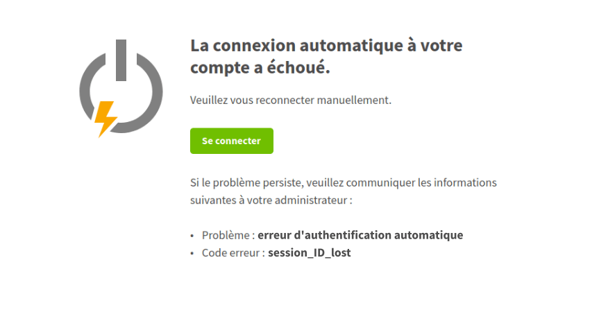
I also put some effort in such apparently trivial matters as error screens. It’s a way of making users confident that they won’t be left unassisted even in case something goes wrong.
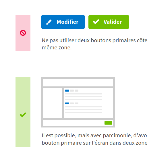
With this kind of product, more than ever, UI design must encompass both an artistic approach and a scientific point of view. Beyond personal bias and aesthetic considerations, how do I make sure this button is identified as clickable? When is it okay to use an icon rather than text? Which cursors can I move in order to create a clear visual hierarchy?
These kinds of questions must be addressed with a rational approach, relying on credible sources and user feedback.